How I Created Team Design Pattern
Initial Delivery
6 months
Role
Lead UX Designer in the team of 9 contributing UX Designers, 2 front-end developers, 2 product designers
Impact
Delivered fully Fiori-compliant mocks for consistent user experience, improved the productivity by reducing inconsistency and redundant communication • Managed app design pattern designers can reuse in Sketch / InVision (total 20 versioning) and Figma with 9 contributors, 40% of the symbols were created from the scrath, increased collaboration between designers with 2 team design reviews per week • Held all total 25 weekly cross-functional team sync-ups, shared design specs and interactive mocks

Background
Call for Design Consistency
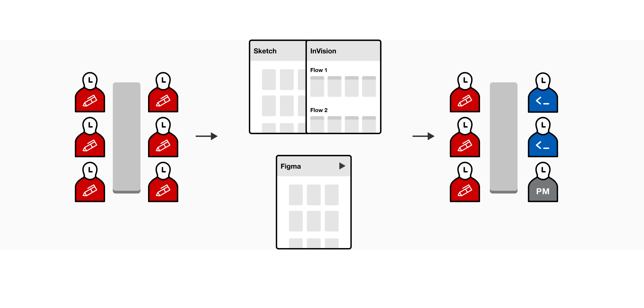
When I first came to the Sourcing design team, all the apps teams worked in silos having different design patterns and guidelines. As a part of the SAP IES initiative for UX consistency, our team was one of few teams in Ariba who could start adopting the SAP Fiori design system early on for the guided beta of the redesigned app. I created a Sketch team design pattern library (which later I converted to Figma as well) so designers can share their design patterns and make the app-wide design consistent. It also can help avoid inefficiencies in development and lack of clarity when there are new team members get on board the team.

Project Journey 1
Collecting Patterns Bottom Up
I started out reaching out to all team designers to collect all the components and their use cases in the app. We held two design critique sessions every week where designers can freely share their designs and discuss the pattern usage and its scalability before signing off to developers. I documented all new updates, open issues, and implementation status in the library.
Project Journey 2
Designing Interactions with Developers
I worked closely with developers to discuss the specs and make sure the design is implemented correctly. We had weekly sync up with developers to discuss new components and the development statuses. One clear demo could be way more effective than the spec with lengthy descriptions. For instance, I created a Javascript animation demo using SAP Fundamentals Angular components to show sticky behavior for page, section, and table headers.
Project Journey 3
Creating New Patterns
While aligning the existing components to the design system, designers and I also worked on creating sourcing-specific patterns such as form search, page-wide chooser, also tables. For example, as Sourcing app is table-heavy application, grid table pattern with the cell inline editability is critical for users to quickly edit their data from the first-depth pages.
Project Journey 4
Migrating to Figma
Meanwhile, we were one of the first waves that migrated our team design library to Figma as soon as SAP design team onboarding started. The goal for Figma migration was to create the pattern as flexible as possible utilizing new features such as auto-layout and frames. With one design intern, I listed out all in-development patterns and their variations. The full migration took 1 month and updated upon new projects. I also created a quick guide for Figma (with cute mini tutorials!)!

Project Journey 5
Aligning with Broader Design System
I shared the team library with the broader Apps design framework team to share Sourcing use cases and our design rationales. There is still an ongoing team effort to make UX consistency across different products. I created Sourcing - Fiori Index that designers can see and compare the design, development status in both Sourcing native and Fiori components so designers can decide on what components to use.

Lessons Learned
Adopted Fiori design system and delivered fully Fiori-compliant mocks for consistent user experience, improved the productivity by reducing inconsistency and redundant communication • Managed app design pattern designers can reuse in Sketch / InVision (total 20 versioning) and Figma with 9 contributors, 40% of the symbols were created from the scrath, increased collaboration between designers with 2 team design reviews per week • Held all total 25 weekly cross-functional team sync-ups, shared design specs and interactive mocks • The pattern library's impact can be limited without understanding the full use cases, spend time to research on components and their variations. • It's always good to keep up with the latest consumer UI trend but don't forget you are dealing with enterprise product, maybe you are cutting out possible use cases. • While consistency is the key of seamless enterprise UX, my product persona's use cases could be varied from the usual cases


