Visibility Condition Builder UI
Initial Delivery
6 months
Role
Lead UX Designer in the team of 9 contributing UX Designers, 2 front-end developers, 2 product designers
Impact
Created and managed app design pattern designers can reuse via Sketch / InVision • Converted all Sourcing-wide design pattern into Figma library (1 month) and shared Figma onboarding guidelines for designers • Held weekly sync-up for components and design implementation with developers and product managers (6 months) and shared interactive mocks

Background
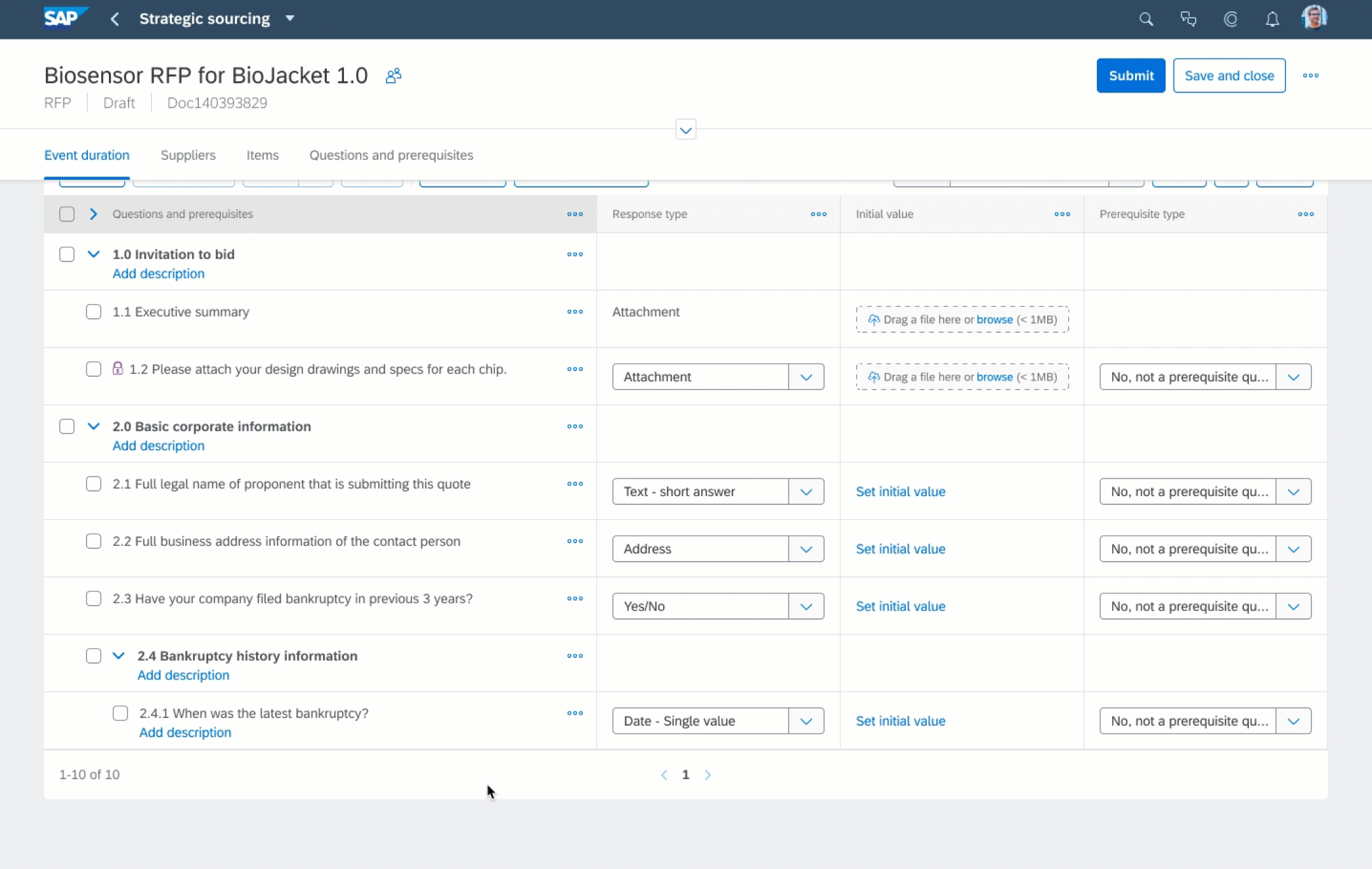
Often sourcing managers want to add questions or content that are visible only when the supplier responded with a certain answer. For instance, a sourcing event template would show additional compliance requirement materials for only who responded they are located in Europe.
Problem
After looking at the legacy UI, the first thing that came up my mind was: 'Is this a maze on the screen?' Even having very similar functionalities with other products, I realized that our product has a bigger gap between expectations and actual behaviors. I proposed some enhancements based on some secondary research on similar features and use cases:

Design
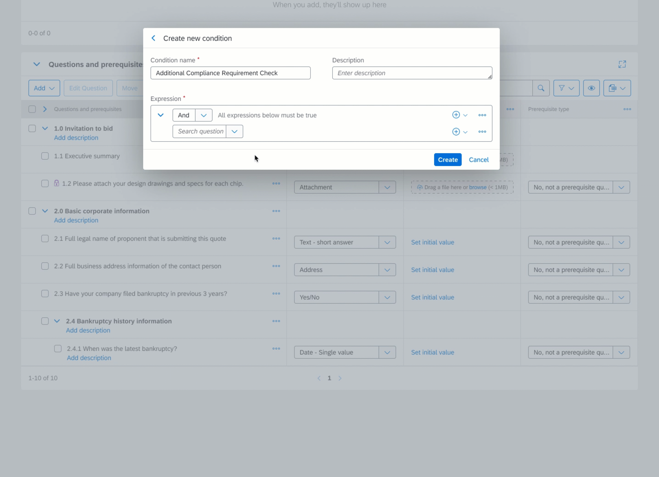
Condition Manager
There was already numerous customer feedback asking about enhancing the poor search results in supplier invitation. Therefore, I collected user feedback to identify what are the most common parameters for the search. Meanwhile, we collaborated with the data science team to come up with the use cases where recommendations can be useful. As a result, I came up with 2 refined user stories that can use recommendations and search.
Design
Creating Simple Expressions
When creating new conditions, admins can create rows and groups before/after/inside each row and group
Design
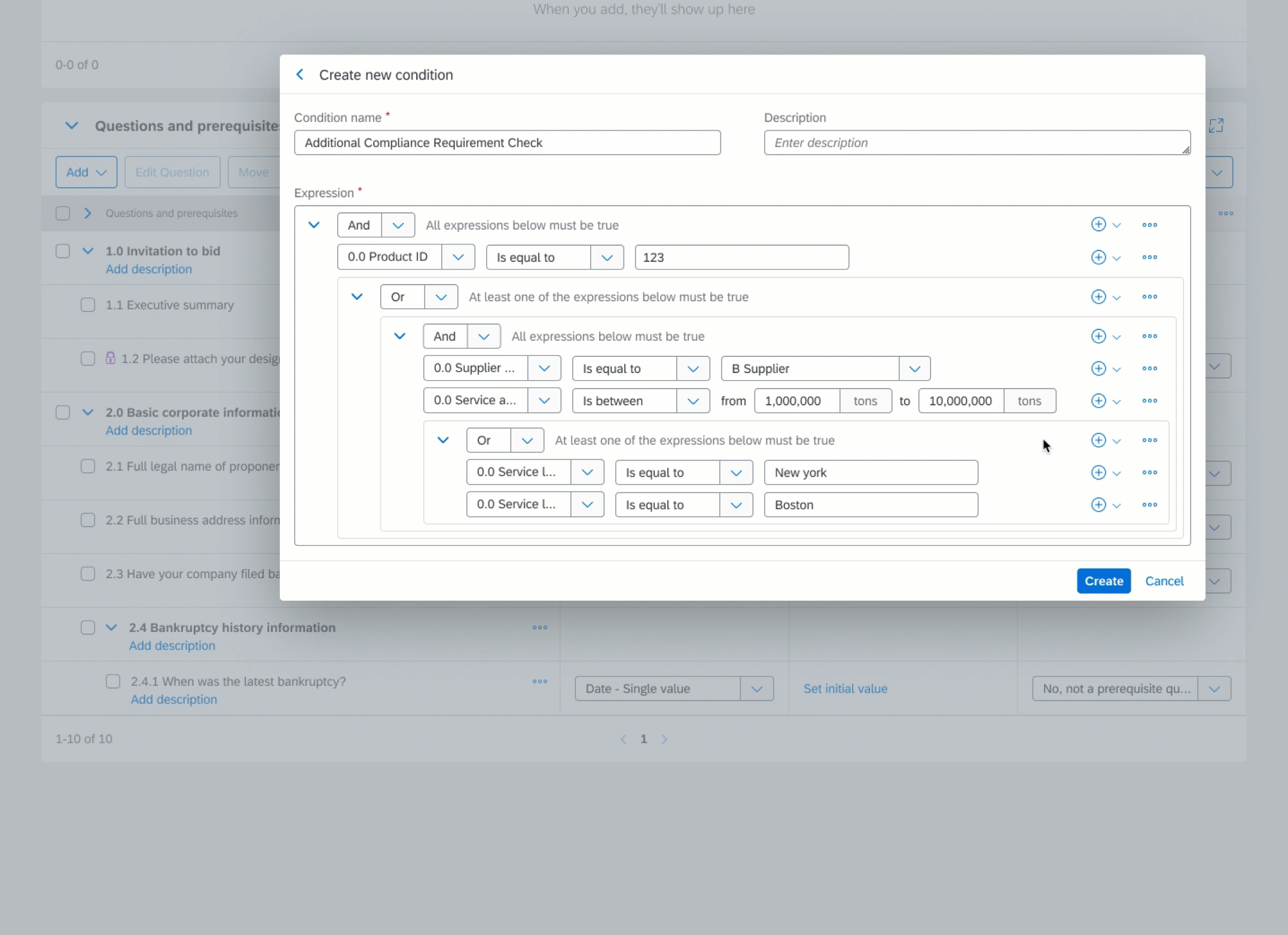
Creating Complex Expressions
If there are multiple criteria, admin can collapse and expand groups
Interaction
I delivered fully interactive Figma mocks and detailed specs for the responsive dialogs that can accommodate complex conditions with multiple groups and rows.

Lessons Learned
While it's easy to just remove the cluttered, the real value comes out from making the cluttered decluttered. I first focused on understanding how the feature works thoroughly and understand the use cases. • Using dialogs in moderation, giving contextual information is good but the feature can be bigger than you thought. • For working with UX engineers, defining each element clearly and their roles early on are important to make common ground. • Always keep accessibility in mind, show labels and any changes always visible.


