Supplier Invitation UX
Initial Delivery
6 months
Role
Lead UX Designer in the team of 9 contributing UX Designers, 2 front-end developers, 2 product designers
Impact
Created and managed app design pattern designers can reuse via Sketch / InVision • Converted all Sourcing-wide design pattern into Figma library (1 month) and shared Figma onboarding guidelines for designers • Held weekly sync-up for components and design implementation with developers and product managers (6 months) and shared interactive mocks

Background
Selecting and shortlisting suppliers in sourcing events is a big part of the sourcing projects through a comprehensive analysis of existing suppliers as well as discovery research on the new supply market. Oftentimes, an organization can have a supplier segmentation and selection criteria that the sourcing manager can follow, but everything has to be manual and repetitive in the current solution. The team wants to revamp the supplier search & chooser UX so the experience can be more efficient and smart for sourcing managers.
Problem
We want to reduce the time that sourcing managers manually search for organizations and contacts for the invitation.
Research
Provide help ahead
There was already numerous customer feedback asking about enhancing the poor search results in supplier invitation. Therefore, I collected user feedback to identify what are the most common parameters for the search. Meanwhile, we collaborated with the data science team to come up with the use cases where recommendations can be useful. As a result, I came up with 2 refined user stories that can use recommendations and search.

Design
For Simple Events
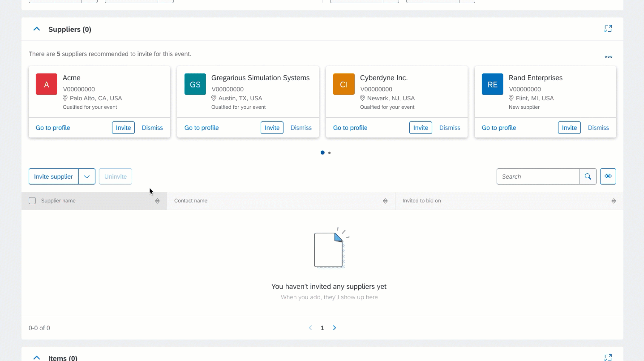
Users can see recommendations in zero state table
Design
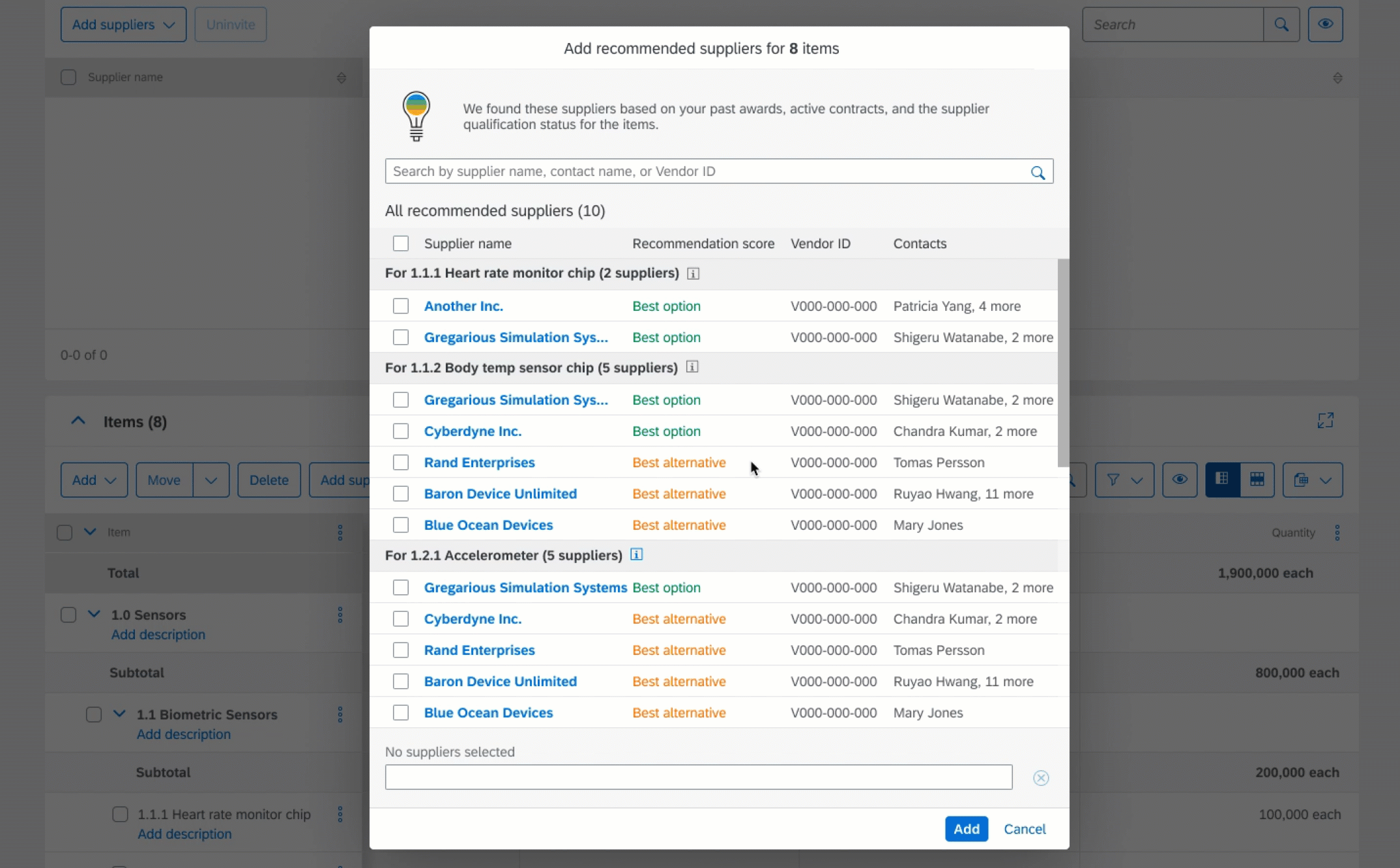
For Complex Events
There is still an ongoing team effort to make UX consistency across different products. I shared the team library with the broader Apps design framework team to share Sourcing use cases and our design rationales. In the meantime, I created Sourcing - Fiori Index that designers can see and compare the design, development status in both Sourcing native and Fiori components so designers can decide on what components to use. Here are the completed design patterns in Figma.
Design
For Search
If user wants to find a specific supplier with the organization or contact informatioon, they can go to Advanced search chooser with supplier filters

Test
Especially for item-level supplier recommendations, I tested the prototypes with 5 participants (indirect sourcing managers, sourcing specialists).

Component Building
Make the Common Component Reusable
Supplier search & selection UX is not only the case for Sourcing but also a very common pattern for other buying apps. I shared the use cases and designs with the Supplier Management app, Contracts, and Buying app designers to come up with 3 design patterns that designers can use across the apps.

Lessons Learned
For enterprise software UX, always consider the consequences of my designs and think big, there always could be use cases I haven't discovered. • Consistency across apps gives users comfort and low memory burden when they see a new interaction. • This was my first time to collaborate with an intern, I was impressed by her moderating and improvisation skills in the user sessions!


